What Is A
Poster Anyway?
![]()
![]()
|
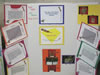
Basic Constraints: Use a regular poster session board (usually three panels and it folds up). You can buy them at the campus bookstore or at an office supply store. There can be no mechanical or electrical devices on your poster (this isn’t a science fair after all). All material must be accessible without having to lift or turn pages. Everything must be on the poster itself; there can be no materials placed in front of, above, below, or to the side of the poster.
Planning: Focus on introduction, methods, results and discussion, summary, and references. Make a small scale sketch of poster to ascertain that all points you want to stress as well as headlines, text, figures and tables, photos, etc., will fit into the dimensions allowed. A rough layout on a chalk board is a nice way to see if the presentation makes a “visual” statement, drawing us to the main points and ensuring that our interest is captured at first sight.
Organization: The poster should start in the upper left hand corner and flow generally from left to right and from top to bottom (up/down columns are easier to follow than rows). The title and your name must be at the top of the board. If necessary, use letters, numbers, or arrows to indicate proper flow to the class.
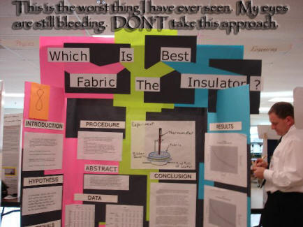
Simplicity: Don’t crowd too much information into the presentation; concentrate on two or three main points. Highlight those main points with simplified graphics and diagrams. Don’t be arty or overly ornate (this detracts from impact of your information). Use text cautiously. Often it is better to use outlines and bullets than paragraphs. Avoid overwhelming us with too many numbers or words. Yet, as people will have to understand the poster while you are looking at other people’s, make certain the message is clear and simple. The entire poster must be as self-explanatory as possible. Lettering: The basis for a successful poster is a balanced mixture of textual and pictorial presentation of the work. A clear, simple, uncluttered
arrangement is the most attractive and the easiest to read. All lettering
should be legible from a distance of three feet. Type size should be at
least 16 point, in bold style. The typeface chosen should be a simple
and clear one. Whereas titles should be in all capital letters, the rest of
the text will be easier to read if typed in a combination of capital and
lower-case letters.
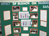
Illustrations and Pictures: Illustrations should be simple and eye-catching, with unnecessary detail left out. Figures or illustrations should not be smaller
than 5 x 7 inches. All illustrations must be given a caption (brief title, key
words). Photos should be enlarged enough to show relevant detail. Use
colors for emphasis and to provide contrast. For example the featured parts
of the poster could be highlighted with warm colors, and the less important
parts could be done in cool colors. Do not use standard computer printouts
or type written material on posters unless the type is enlarged to be legible.
Mounting: Mount pictures, graphs, and diagrams on paper of contrasting colors. Mount letters on white or light-colored paper for best results. In turn, this can be attached to another piece of colored paper. Some color combinations which provide great contrast are black on yellow, black on orange, green on white, red on white, and white on black. |
![]()
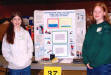
Posters, at least for this project, are self-standing visual displays of some key aspect from your educational autobiography. This session is designed to give each of us an opportunity to learn something about you, your educational experience, and how you’ve analyzed it for the project . . . without you having to present it to us in a front-of-the-room talk. Obviously, all poster materials are your responsibility.
We will grade your posters based on the following:
1) Quality and work effort
2) Originality and value of educational concepts presented
3) Use of diagrams or pictures
4) Minimum use of verbiage
5) Overall visual presentation.
![]()